Dont Panic!
Keep Speaking Portuguese


My goal was to craft a bold, energetic brand that motivates learners and captures the unmistakable vibrancy of Brazilian culture.


The Challenge:
I know firsthand how overwhelming it can feel to learn something new. Whether it’s a language or building a brand. It’s easy to get caught up in the complexity and lose sight of what really matters.
For this project, I needed to create a brand that:
- Felt approachable and motivating for learners
- Reflected the bold, fun energy of Brazil
- Stood out clearly in a crowded podcast landscape
My Approach:
1. I started by uncovering the essence.
Just like language learning, I believe brand discovery starts with patience and listening.
I spent time with the client to understand:
- What motivates their audience?
- Why do learners keep coming back?
- What makes their teaching style different?
I kept coming back to three ideas: bold confidence, conversational flow, and cultural immersion. Those became the foundation of my design choices.
2. I let the brand speak for itself.
I focused on creating visuals and language that communicate instantly, even before a single word is spoken.
Here’s how I approached it:
- Bold typography to express confidence
- Energetic color palette to reflect Brazilian vibrancy
- Studio-inspired elements to convey the podcast’s dynamic flow
- Conversational voice to invite and encourage learners
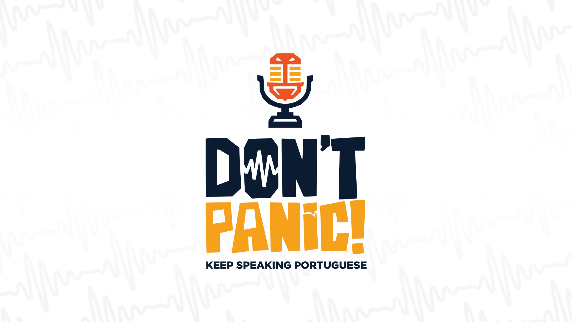
The Result
The final brand identity feels bold and motivating, conversational and approachable, and unmistakably rooted in Brazilian culture.
I designed a clean, confident logo with modern letterforms, and built a vibrant color palette of deep blues, warm yellows, rich oranges, and soft tans — all inspired by the energy of Rio. To balance professionalism with fun, I paired a bold sans-serif typeface with humanist accents that add warmth and personality. I also wove in subtle textures and tiki-inspired, beachy elements to reflect the coastal vibrancy of Rio, giving the brand an inviting flow that stands out while still feeling polished.


.jpg)

